needs(sf, tidyverse, leaflet, spdep)Chapter 16: Working with Spatial Data
This tutorial demonstrates how to work with spatial data in R, specifically focusing on analyzing German electoral districts. We’ll cover basic mapping, projections, spatial statistics including local and global versions of Moran’s I, and creating interactive visualizations with leaflet. We’ll use the sf package for handling spatial data and ggplot2 for visualization.
Basic operations with sf
In this first chunk, we load a shapefile of German electoral districts and create a basic map using ggplot2. The shape file needs to be downloaded upfront (link).
st_transform(4326) converts the coordinates to the standard WGS84 system. We color each district by its state (LAND_NAME) to get an overview of Germany’s federal structure.
Finally, we can plot them using sf’s very on geom_sf which works with ggplot2.
shape_electoral_districts <- st_read("files/btw25_geometrie_wahlkreise_shp_geo/btw25_geometrie_wahlkreise_shp_geo.shp") |>
  st_transform(4326)
Reading layer `btw25_geometrie_wahlkreise_shp_geo' from data source
`/Users/felixlennert/Library/Mobile Documents/com~apple~CloudDocs/Documents/Documents/phd/teaching/toolbox_css/files/btw25_geometrie_wahlkreise_shp_geo/btw25_geometrie_wahlkreise_shp_geo.shp'
using driver `ESRI Shapefile'
Simple feature collection with 299 features and 4 fields
Geometry type: MULTIPOLYGON
Dimension: XY
Bounding box: xmin: 5.872471 ymin: 47.27012 xmax: 15.04044 ymax: 55.05838
Geodetic CRS: WGS 84shape_electoral_districts |>
ggplot() +
geom_sf(aes(fill = LAND_NAME), alpha = 0.8, col = "white") +
labs(title = "States of Germany")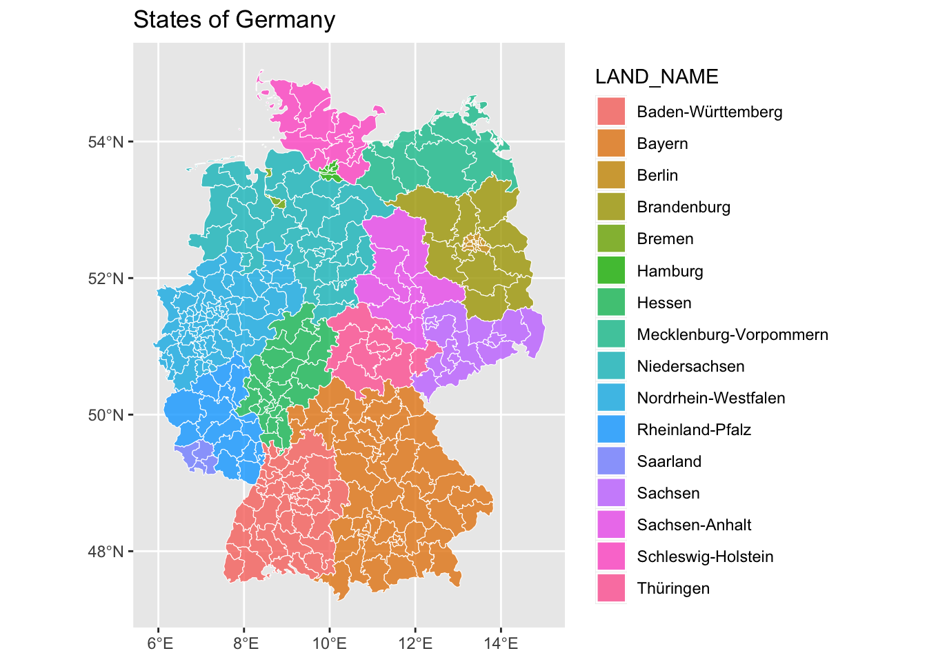
Next, we experiment with different map projections. The Mollweide projection is a global equal-area projection that preserves area proportions but distorts shapes, especially at high latitudes. While it’s commonly used for world maps, it may not be optimal for country-level analysis of Germany.
shape_electoral_districts |>
ggplot() +
  geom_sf(aes(fill = LAND_NAME), alpha = 0.8, col = "white") +
  coord_sf(crs = "+proj=moll") +
  labs(title = "States of Germany",
       subtitle = "Mollweide projection") +
  theme_minimal()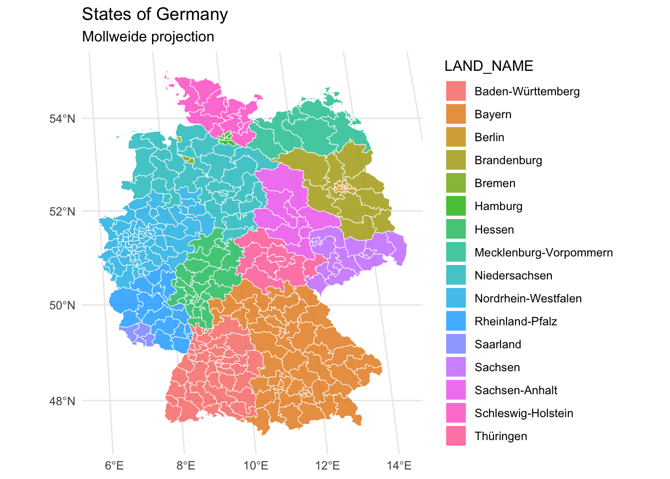
Therefore, we now use EPSG:4839 (DHDN / 3-degree Gauss zone 3), which is a projection specifically designed for Germany (see this website to find adequate projections). This projection provides a better representation of the country’s geography as it minimizes distortion for this specific region. Notice how the proportions look more natural compared to the previous projections.
shape_electoral_districts |>
ggplot() +
  geom_sf(aes(fill = LAND_NAME), alpha = 0.8, col = "white") +
  coord_sf(crs = 4839) +
  labs(title = "States of Germany",
       subtitle = "Using adequate projection") +
  theme_minimal()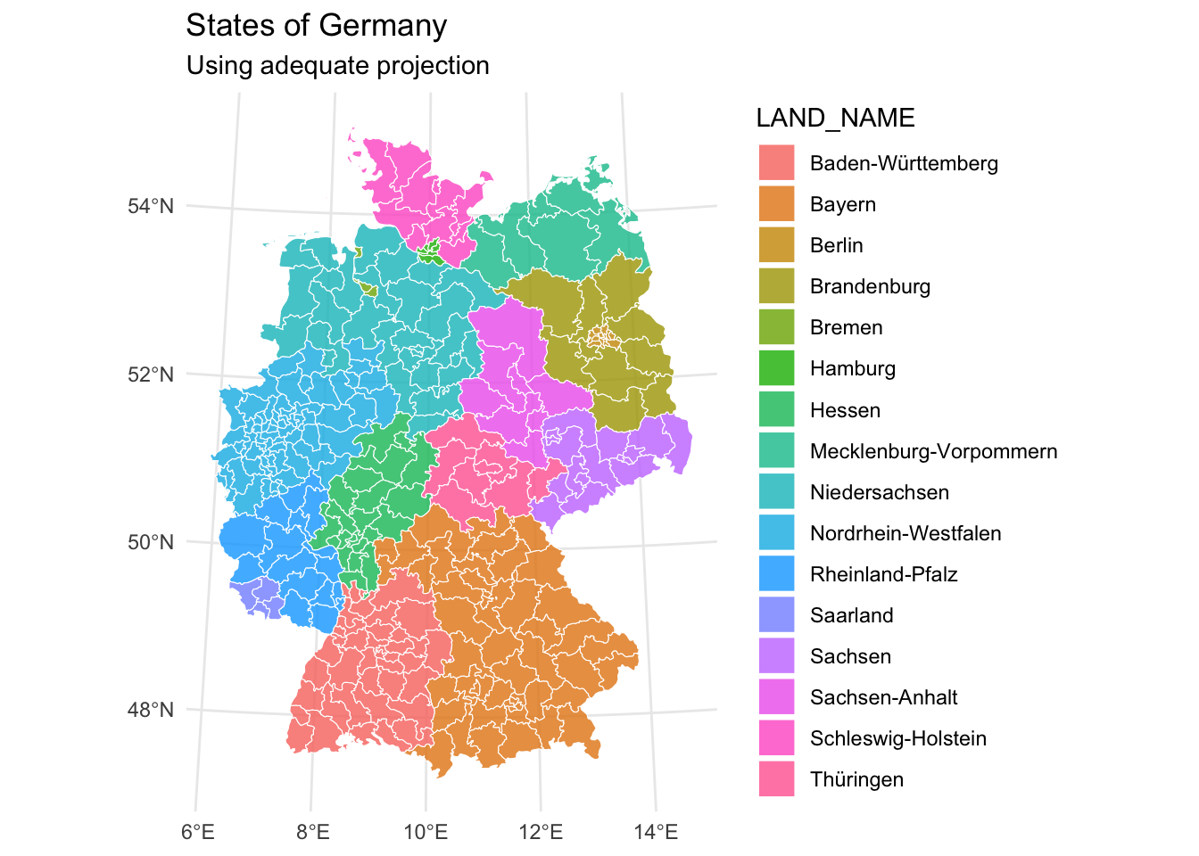
Add data to shape file
Now we move on to analyze voting behavior on a spatial level. First, we load and clean electoral data from a CSV file. The data can be found here. The data contains voting results including:
- First and second votes (Erststimme/Zweitstimme)
- Number of eligible voters
- Actual votes cast
- Invalid votes
- Votes per party
We perform several data cleaning steps including handling missing values, removing leading zeros of the district numbers (so that we can finally merge it with the districts in the shape file). We also need to merge two districts. Finally, we can join them to our shape file using normal dplyr functions. This is as sf treats shape files as a normal data frame with an added geometry column that is used for all spatial operations.
turnout_votes <- read_delim("files/kerg.csv", skip = 2, delim = ";", show_col_types = FALSE) |>
  select(1:2, possible_votes_erststimme = Wahlberechtigte,
         possible_votes_zweitstimme = ...5, actual_votes_erststimme = Wählende, actual_votes_zweitstimme = ...10,
         invalid_votes_erststimme = 12,
         invalid_votes_zweitstimme = 14,
         cdu_erst = 20, cdu_zweit = 22, spd_erst = 24, spd_zweit = 26,
         afd_erst = 28, afd_zweit = 30, fdp_erst = 32, fdp_zweit = 34,
         left_erst = 36, left_zweit = 38, greens_erst = 40, greens_zweit = 42,
         csu_erst = 44, csu_zweit = 46) |>
  slice(3:334) |>
  drop_na(Nr) |>
  mutate(nr_filled = case_when(str_length(Nr) == 2 ~ Nr,
                               TRUE ~ NA)) |>
  fill(nr_filled, .direction = "up") |>
  filter(nr_filled != Nr) |>
  janitor::clean_names() |>
  mutate(nr = str_remove_all(nr, "^0{1,2}") |> as.integer()) |>
  left_join(read_delim("files/kerg.csv", skip = 2, delim = ";", show_col_types = FALSE) |>
              filter(`gehört zu` == 99) |>
              select(1:2),
            by = c("nr_filled" = "Nr")) |>
  relocate(Gebiet) |>
  rename(state = Gebiet, district = gebiet) |>
  select(-nr_filled) |>
  mutate(union_erst = case_when(is.na(cdu_erst) ~ csu_erst,
                                TRUE ~ cdu_erst),
         union_zweit = case_when(is.na(cdu_zweit) ~ csu_zweit,
                                 TRUE ~ cdu_zweit)) |>
  select(-cdu_erst, -cdu_zweit, -csu_erst, -csu_zweit) |>
  mutate(across(possible_votes_erststimme:union_zweit, \(x) x |> as.numeric()))


turnout_votes_fixed <- bind_rows(
  turnout_votes |> filter(nr < 70),
  turnout_votes |>
  filter(district %in% c("Dessau – Wittenberg", "Anhalt")) |>
  mutate(nr = 70,
         district = "Anhalt – Dessau – Wittenberg") |>
  group_by(nr, district) |>
  summarize(across(3:19, \(x) x |> sum(), .names = "{.col}")),
  turnout_votes |> filter(nr > 71) |> mutate(nr = nr - 1)
) |>
  fill(state)


## add electoral data to shape file
shape_electoral_districts_turnout_votes <- left_join(
  shape_electoral_districts,
  turnout_votes_fixed,
  by = c("WKR_NR" = "nr")
) |>
  pivot_longer(matches("zweit\\b"), names_to = "party", values_to = "votes") |>
  mutate(party = str_remove(party, "\\_zweit"))
Then we can visualize these data:
shape_electoral_districts_turnout_votes |>
ggplot() +
  geom_sf(aes(fill = state), alpha = 0.8, col = "white") +
  coord_sf(crs = 4839) +
  labs(title = "States of Germany",
       subtitle = "Using adequate projection") +
  theme_minimal()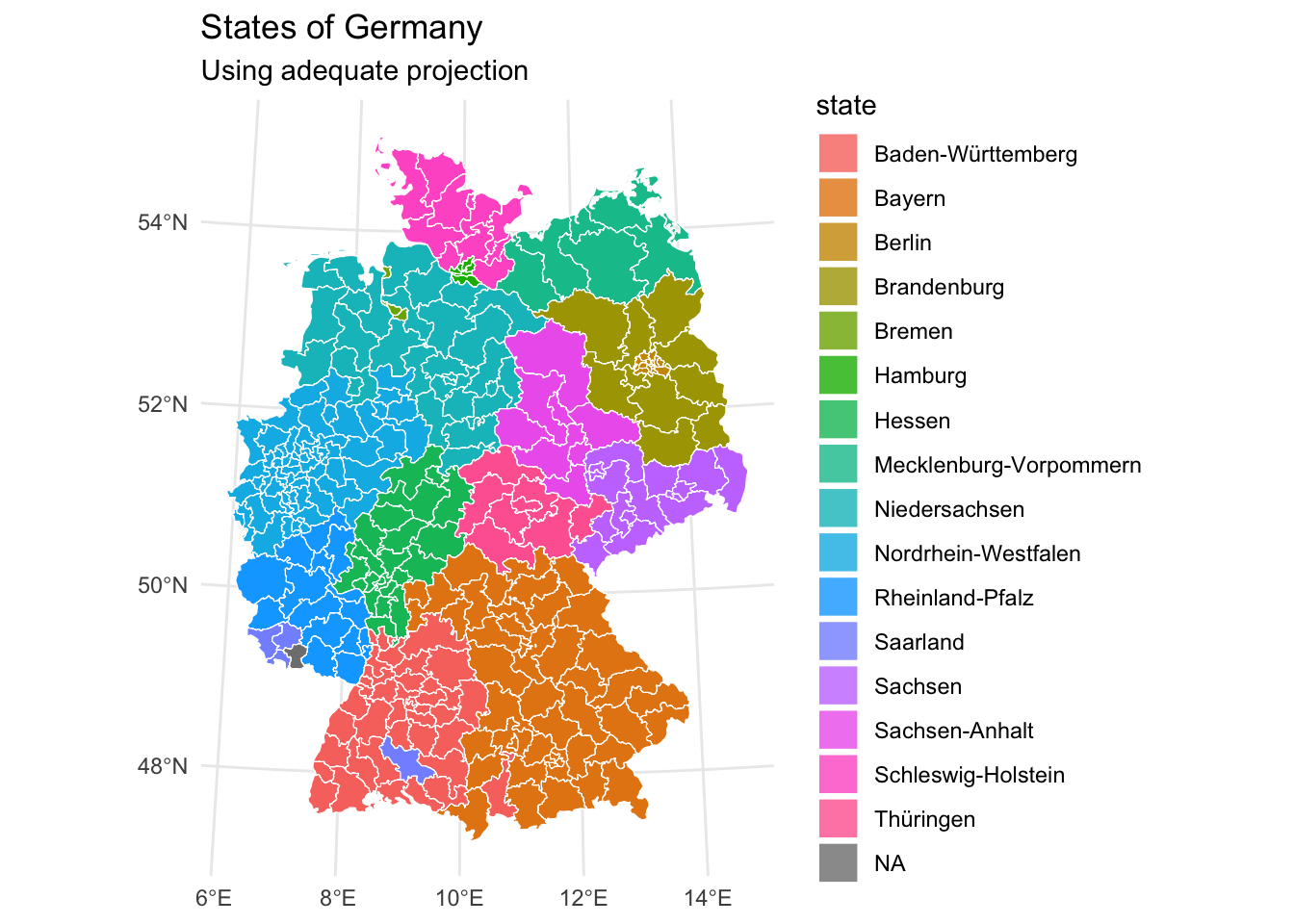
Merge Polygons
Note that some districts are not colored according to their actual state. This comes about as, in our shape file, the district “Ostallgäu” is divided into two districts, and therefore the two data sets’ district numbers do not align. Luckily, sf’s st_union() function enables us to melt the superfluous districts into one district, so that both election results and spatial information are matched.
fixed_districts <- bind_rows(
  shape_electoral_districts |> filter(WKR_NR < 255),
  shape_electoral_districts |>
    filter(WKR_NR %in% c(255, 257)) |>
    mutate(WKR_NR = 256) |>
    group_by(WKR_NR) |>
    summarize(WKR_NAME = "Ostallgäu",
              geometry = st_union(geometry)),
  shape_electoral_districts |>
    filter(WKR_NR == 256) |>
    mutate(WKR_NR = 255),
  shape_electoral_districts |> filter(WKR_NR > 257) |> mutate(WKR_NR = WKR_NR - 1)) |>
  fill(LAND_NAME)

shape_turnout_vote_fixed <- left_join(
  fixed_districts,
  turnout_votes_fixed,
  by = c("WKR_NR" = "nr")
) |>
  pivot_longer(matches("zweit\\b"), names_to = "party", values_to = "votes") |>
  mutate(party = str_remove(party, "\\_zweit"))
After fixing the district boundaries, we create another visualization to verify our changes. The map should now show consistent boundaries with no gaps or overlaps between districts. This clean spatial structure is essential for further analysis.
shape_turnout_vote_fixed |>
ggplot() +
  geom_sf(aes(fill = state), alpha = 0.8, col = "white") +
  coord_sf(crs = 4839) +
  labs(title = "States of Germany",
       subtitle = "Using adequate projection") +
  theme_minimal()
Much better!
However, we might want to only show states sans districts. To this end, we dissolve the individual districts into state-level polygons using st_union(). This creates a simplified map showing just the state boundaries, which can be useful for higher-level analysis or overview visualizations.
Moreover, st_union() is key to address the modifiable areal unit problem, e.g., by investigating how different areal units affect a target variable.
fixed_districts |>
  group_by(LAND_NAME) |>
  summarize(geometry = st_union(geometry)) |>
  ggplot() +
  geom_sf(aes(fill = LAND_NAME), alpha = 0.8, col = "white") +
  coord_sf(crs = 4839) +
  labs(title = "States of Germany",
       subtitle = "Using adequate projection") +
  theme_minimal()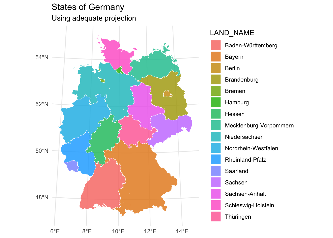
Calculating areas
In the next visualization, we add the area of each state in square kilometers. We first transform the coordinates to ensure accurate area calculations, then compute the area using st_area().
fixed_districts |>
  st_transform(crs = 4839) |>
  group_by(LAND_NAME) |>
  summarize(geometry = st_union(geometry)) |>
  mutate(area_m2 = st_area(geometry) |> as.numeric(),
         area_km2 = area_m2/1000000) |>
  ggplot() +
  geom_sf(aes(fill = area_km2), alpha = 0.8, col = "white") +
  labs(title = "States of Germany",
       subtitle = "Using adequate projection") +
  theme_minimal()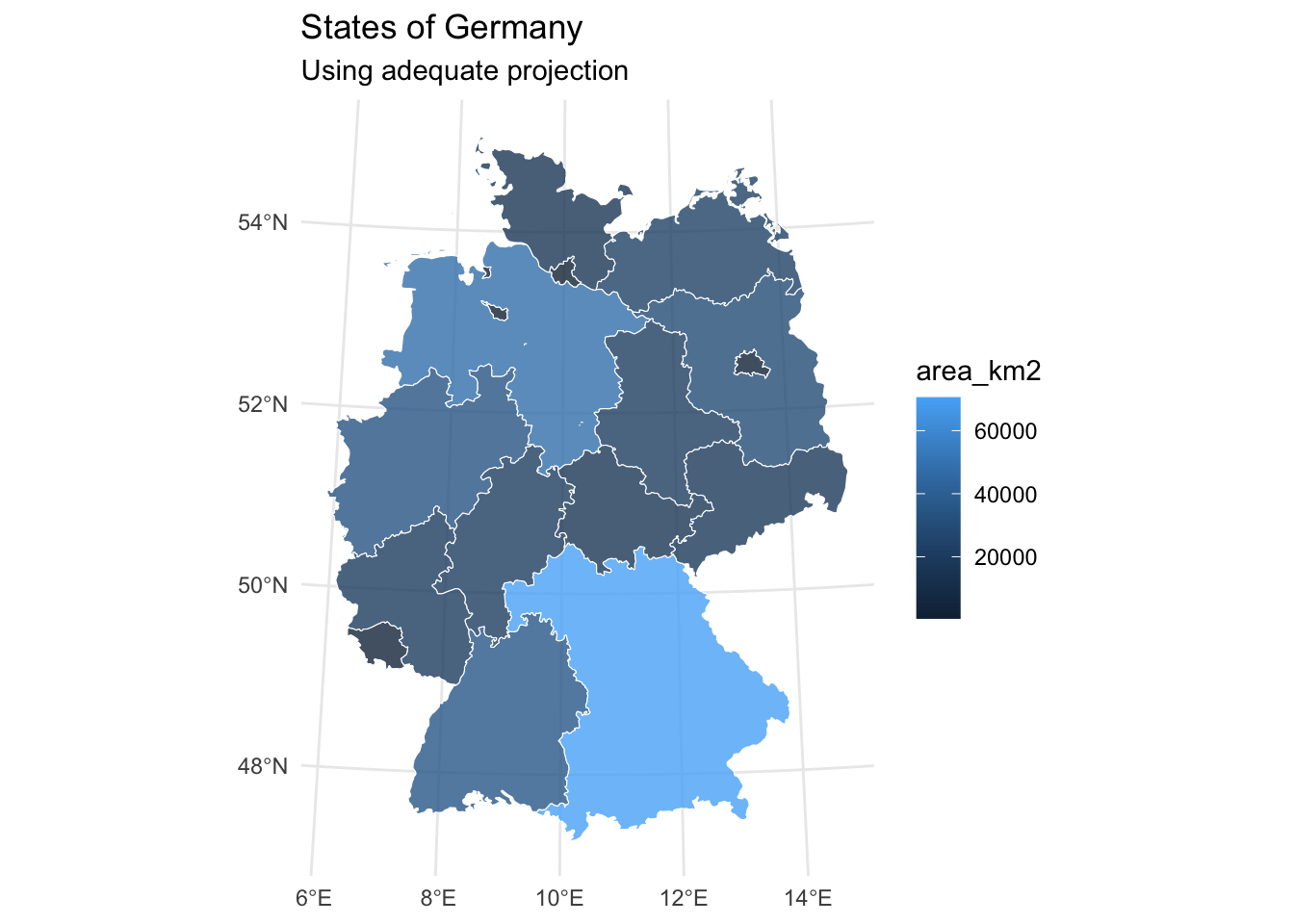
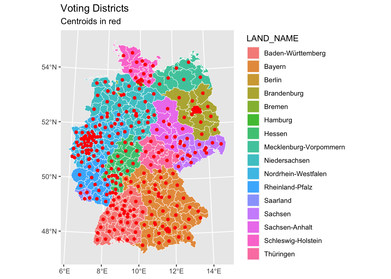
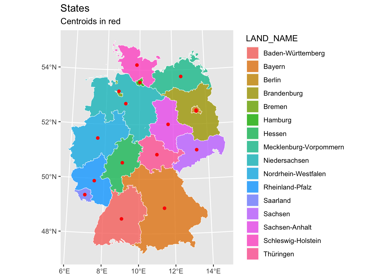
We can also introduce centroids. Centroids are useful for:
- Calculating distances between regions
- Placing labels on maps
- Simplifying spatial relationships
The red dots indicate the calculated center points, with separate maps showing district-level and state-level centroids.
districts_centroid <- fixed_districts |>
  st_transform(crs = 4839) |>
  st_centroid()

fixed_districts |>
  st_transform(crs = 4839) |>
  ggplot() +
  geom_sf(aes(fill = LAND_NAME), alpha = 0.8, col = "white") +
  geom_sf(data = districts_centroid, col = "red") +
  labs(
    title = "Voting Districts",
    subtitle = "Centroids in red"
    )
states_centroid <- fixed_districts |>
  st_transform(crs = 4839) |>
  group_by(LAND_NAME) |>
  summarize(geometry = st_union(geometry)) |>
  st_centroid()

fixed_districts |>
  st_transform(crs = 4839) |>
  group_by(LAND_NAME) |>
  summarize(geometry = st_union(geometry)) |>
  ggplot() +
  geom_sf(aes(fill = LAND_NAME), alpha = 0.8, col = "white") +
  geom_sf(data = states_centroid, col = "red") +
  labs(
    title = "States",
    subtitle = "Centroids in red"
    )
Calculate distances
We can also calculate distances between regions. Here, we choose Bavaria and Saxony. We show two approaches:
- Distance between borders (which is 0 since they share a border)
- Distance between centroids (which gives us the approximate distance between the centers of these states)
The distances are Euclidean and converted to kilometers for easier interpretation.
bavaria <- fixed_districts |>
  st_transform(crs = 4839) |>
  group_by(LAND_NAME) |>
  summarize(geometry = st_union(geometry)) |>
  filter(LAND_NAME %in% c("Bayern"))
saxony <- fixed_districts |>
  st_transform(crs = 4839) |>
  group_by(LAND_NAME) |>
  summarize(geometry = st_union(geometry)) |>
  filter(LAND_NAME %in% c("Sachsen"))

st_distance(bavaria, saxony, by_element = TRUE) # distance is zero because borders
0 [m]bavaria_centroid <- fixed_districts |>
st_transform(crs = 4839) |>
group_by(LAND_NAME) |>
summarize(geometry = st_union(geometry)) |>
filter(LAND_NAME %in% c("Bayern")) |>
st_centroid()
saxony_centroid <- fixed_districts |>
st_transform(crs = 4839) |>
group_by(LAND_NAME) |>
summarize(geometry = st_union(geometry)) |>
filter(LAND_NAME %in% c("Sachsen")) |>
st_centroid()
st_distance(bavaria_centroid, saxony_centroid, by_element = TRUE) |>
units::set_units(km) 272.2785 [km]Moran’s I
This is all fun and games, but let’s analyze some voting data. In a first step, we eyeball who won which district (according to “Zweitstimme”).
#-- moran's I

party_colors <- c(
  "left" = "#d837f0",
  "spd" = "#e2001a",
  "greens" = "#1faf12",
  "fdp" = "#feed01",
  "union" = "#000000",
  "afd" = "#009ee0"
)

shape_turnout_vote_perc <- shape_turnout_vote_fixed |>
  replace_na(list(votes = 0)) |>
  group_by(district) |>
  mutate(percentage_6_biggest = votes/sum(votes, na.rm = TRUE))

shape_turnout_vote_perc |>
  group_by(district) |>
  filter(percentage_6_biggest == max(percentage_6_biggest)) |>
  ggplot() +
  geom_sf(aes(fill = party), alpha = 0.8, col = "white") +
  coord_sf(crs = 4839) +
  labs(title = "Winning parties in German States",
       subtitle = "Using adequate projection") +
  scale_fill_manual(values = party_colors) +
  theme_minimal()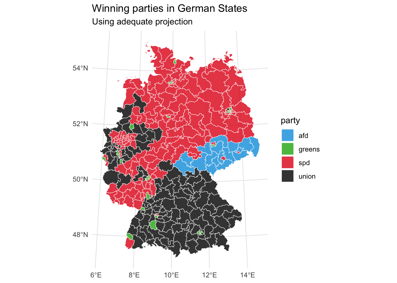
Moran’s I is a key statistic in spatial analysis that helps measure spatial autocorrelation – the degree to which similar values cluster together in space. It ranges from -1 (perfect dispersion) to +1 (perfect correlation), with 0 indicating random spatial distribution. We’ll use it to analyze voting patterns and determine whether similar voting behaviors cluster geographically.
Since Moran’s I requires continuous data, we need to calculate it per party.
First, we determine the weights between districts. Then we can calculate Moran’s I.
weights_singular <- poly2nb(shape_turnout_vote_perc |>
                              filter(party == "spd") |>
                              st_geometry(),
                            queen = TRUE) |> # queen shares point or border
  nb2listw(style = "W")

morans_is <- map(names(party_colors), \(x) shape_turnout_vote_perc |>
                             filter(party == x) |>
                             pull(percentage_6_biggest) |>
                             scale(scale = FALSE) |>
                   moran.test(x = _, listw = weights_singular, alternative = "two.sided"))

morans_is_party_tbl <- tibble(
  party = names(party_colors),
  local_moransi = map_dbl(morans_is, \(x) x|> pluck("estimate") %>% .[[1]]),
  z_scores = map_dbl(morans_is, \(x) x|> pluck("statistic") %>% .[[1]]),
  p_value = map_dbl(morans_is, \(x) x|> pluck("p.value") %>% .[[1]])
)

morans_is_party_tbl
# A tibble: 6 × 4
party local_moransi z_scores p_value
<chr> <dbl> <dbl> <dbl>
1 left 0.746 20.9 1.40e- 96
2 spd 0.783 21.7 9.23e-105
3 greens 0.508 14.2 1.86e- 45
4 fdp 0.779 21.7 3.51e-104
5 union 0.720 20.0 6.30e- 89
6 afd 0.829 23.2 1.27e-118Monte Carlo simulation is important for Moran’s I analysis because:
- It helps establish the statistical significance of observed spatial patterns
- It accounts for the multiple comparisons problem in spatial statistics
- It provides a more robust null distribution than theoretical approaches
The histogram shows the distribution of Moran’s I values under random spatial arrangements, with our observed value marked by the vertical line.
morans_i_left_mc <- moran.mc(shape_turnout_vote_perc |>
                             filter(party == "left") |>
                             pull(percentage_6_biggest) |>
                             scale(scale = FALSE),
                     weights_singular,
                     alternative = "two.sided",
                     nsim = 1000)
morans_i_left_mc$res |> enframe(name = NULL, value = "result") |>
  mutate(statistic = morans_i_left_mc$statistic) |>
  ggplot() +
  geom_histogram(aes(result)) +
  geom_vline(aes(xintercept = statistic))
`stat_bin()` using `bins = 30`. Pick better value with `binwidth`.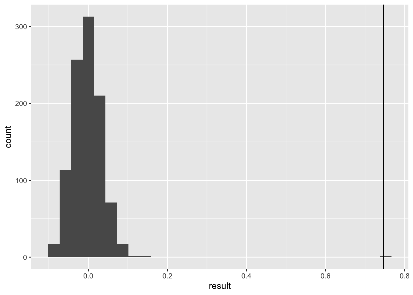
Significant.
Local Moran’s I
Local Moran’s I extends the global measure to identify specific clusters and spatial outliers. While global Moran’s I tells us if clustering exists in our study area, local Moran’s I identifies where these clusters are located. This is particularly useful for identifying hot spots and cold spots of voting behavior.
local_morans_i_afd <- localmoran(shape_turnout_vote_perc |>
                             filter(party == "afd") |>
                             pull("percentage_6_biggest") |>
                             scale(scale = FALSE) |>
                             as.numeric(),
                     weights_singular,
                     alternative = "two.sided")

local_morans_i_afd_tbl <- shape_turnout_vote_perc |>
  ungroup() |>
  filter(party == "afd") |>
  bind_cols(
    tibble(local_moransi = local_morans_i_afd[,1],
         z_scores = local_morans_i_afd[,4],
         p_value = local_morans_i_afd[,5]))

local_morans_i_afd_tbl |>
  ggplot() +
  geom_sf(aes(fill = percentage_6_biggest), alpha = 0.8, col = "white") +
  coord_sf(crs = 4839) +
  labs(title = "Local Moran's I of AfD voting",
       subtitle = "Using adequate projection") +
  theme_minimal()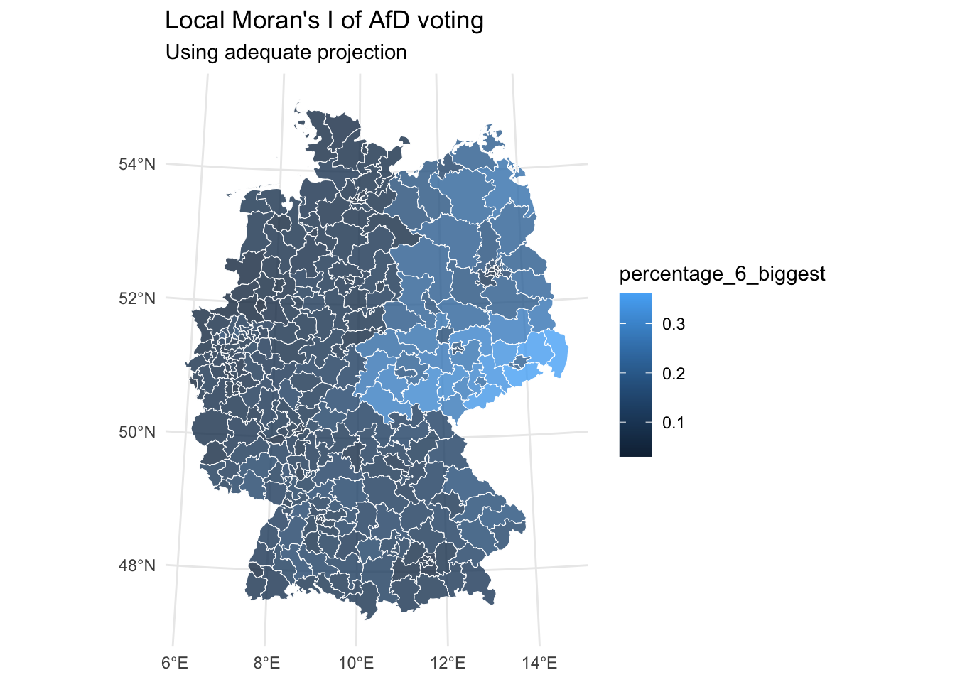
local_morans_i_afd_tbl |>
  ggplot() +
  geom_sf(aes(fill = local_moransi), alpha = 0.8, col = "white") +
  coord_sf(crs = 4839) +
  labs(title = "Local Moran's I of AfD voting",
       subtitle = "Using adequate projection") +
  theme_minimal()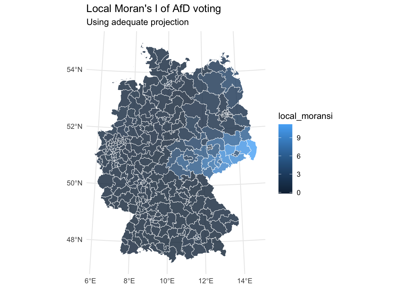
local_morans_i_afd_tbl |>
  ggplot() +
  geom_sf(aes(fill = z_scores), alpha = 0.8, col = "white") +
  coord_sf(crs = 4839) +
  labs(title = "Local Moran's I of AfD voting",
       subtitle = "Using adequate projection") +
  theme_minimal()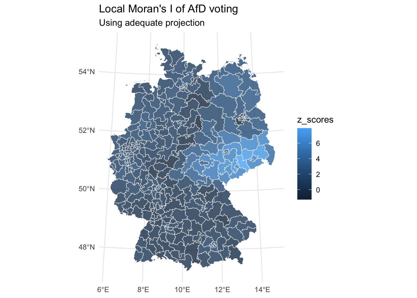
local_morans_i_afd_tbl |>
  ggplot() +
  geom_sf(aes(fill = p_value), alpha = 0.8, col = "white") +
  coord_sf(crs = 4839) +
  labs(title = "Local Moran's I of AfD voting",
       subtitle = "Using adequate projection") +
  theme_minimal()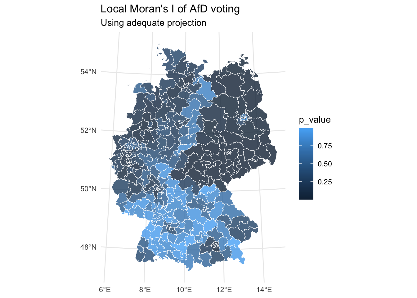
The cluster categories for local Moran’s I analysis represent different types of spatial relationships:
- High-High (red): Areas with high values surrounded by high values (hot spots)
- Low-Low (blue): Areas with low values surrounded by low values (cold spots)
- High-Low (orange): Areas with high values surrounded by low values (spatial outliers)
- Low-High (cyan): Areas with low values surrounded by high values (spatial outliers)
- Not Significant (gray): Areas where spatial clustering is not statistically significant
cluster_color <- c(
  "High-High" = "#FF0000",
  "Low-Low" = "#0000FF",
  "High-Low" = "#FFA500",
  "Low-High" = "#00FFFF",
  "Not Significant" = "#CCCCCC"
  )

local_morans_i_afd_tbl |>
  mutate(spatial_lag = lag.listw(weights_singular,
                                 shape_turnout_vote_perc |>
                                   filter(party == "afd") |>
                                   pull(percentage_6_biggest) |>
                                   scale(scale = FALSE))) |>
  rename(percentage_centered = percentage_6_biggest) |>
  mutate(cluster_type = case_when(
      p_value >= 0.05 ~ "Not Significant",
      percentage_centered > 0 & spatial_lag > 0 ~ "High-High",
      percentage_centered < 0 & spatial_lag < 0 ~ "Low-Low",
      percentage_centered > 0 & spatial_lag < 0 ~ "High-Low",
      percentage_centered < 0 & spatial_lag > 0 ~ "Low-High"
    )) |>
  ggplot() +
  geom_sf(aes(fill = cluster_type), alpha = 0.8, col = "white") +
  coord_sf(crs = 4839) +
  labs(title = "Local Indicators of Spatial Autocorrelation of AfD voting",
       subtitle = "Colored by ",
       fill = "Cluster Type") +
  scale_fill_manual(values = cluster_color) +
  theme_minimal()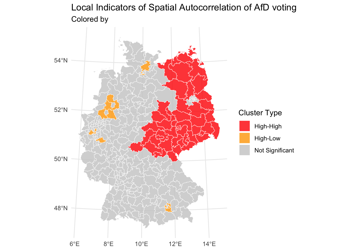
Bonus: Interactive Maps
This code creates an interactive map of German electoral districts, showing which party won each district in the election. The process involves several key steps working together to create a comprehensive visualization.
The data preparation starts by taking our spatial electoral data (shape_turnout_vote_fixed) and identifying winning parties in each district. It groups the data by district number, calculates vote shares for each party within districts, and keeps only the party with the highest vote share.
The map creation begins by transforming the geographical coordinates to WGS84 (standard for web mapping) and initializing a leafletmap. Multiple base map options are added (Light, Dark, and OpenStreetMap styles) that users can switch between. The core visualization comes from adding district polygons, where each district is colored according to its winning party using the predefined color palette.
The interactive elements make the map dynamic and informative. Districts have white borders and partial transparency, with hover effects that highlight the selected district. Each district responds to user interaction with popup information showing district name, state, vote share, and winning party. The fillColor parameter fills the district with the winning party’s color.
Finally, a legend is added to help users identify parties by their colors, and the map includes standard features like a scale bar and layer controls.
winning_parties <- shape_turnout_vote_fixed |>
  group_by(WKR_NR) |>
  mutate(vote_share = votes/sum(votes)) |>
  slice_max(vote_share, n = 1) |>
  ungroup()


# Create the map
winning_parties |>
  st_transform(4326) |>
  leaflet() |>
    addProviderTiles(
      "CartoDB.Positron",
      group = "Light"
    ) |>
    addProviderTiles(
      "CartoDB.DarkMatter",
      group = "Dark"
    ) |>
    addProviderTiles(
      "OpenStreetMap",
      group = "OpenStreetMap"
    ) |>
    addScaleBar(position = "bottomleft") |>
    addLayersControl(
      baseGroups = c("Light", "Dark", "OpenStreetMap"),
      options = layersControlOptions(collapsed = FALSE)
    ) |>
    addPolygons(
      color = "white",
      weight = 1,
      fillColor = unname(party_colors[as.character(winning_parties$party)]),
      fillOpacity = 0.7,
      popup = sprintf(
        "<strong>%s</strong><br/>
        <b>State:</b> %s<br/>
        <b>Vote Share:</b> %.1f%%<br/>
        <b>Winning Party:</b> %s",
        winning_parties$WKR_NAME,
        winning_parties$LAND_NAME,
        winning_parties$vote_share * 100,
        winning_parties$party
      ),
      label = winning_parties$WKR_NAME,
      highlightOptions = highlightOptions(
        weight = 2,
        color = "#666",
        fillOpacity = 0.9,
        bringToFront = TRUE
      )
    ) |>
    addLegend(
      position = "bottomright",
      colors = party_colors,
      labels = names(party_colors),
      title = "Winning Party",
      opacity = 0.7
    )
Exercises
- Look at vote turnout.
- Map turnout, do you see patterns? Think about reasons for lower turnout.
Solution. Click to expand!
turnout <- turnout_votes_fixed |>
  mutate(turnout = actual_votes_zweitstimme/possible_votes_zweitstimme)
left_join(
  fixed_districts,
  turnout,
  by = c("WKR_NR" = "nr")
) |>
  ggplot() +
  geom_sf(aes(fill = turnout), alpha = 0.8, col = "white") +
  coord_sf(crs = 4839) +
  labs(title = "Voting turnout in German Electoral Districts",
       subtitle = "Using adequate projection") +
  theme_minimal()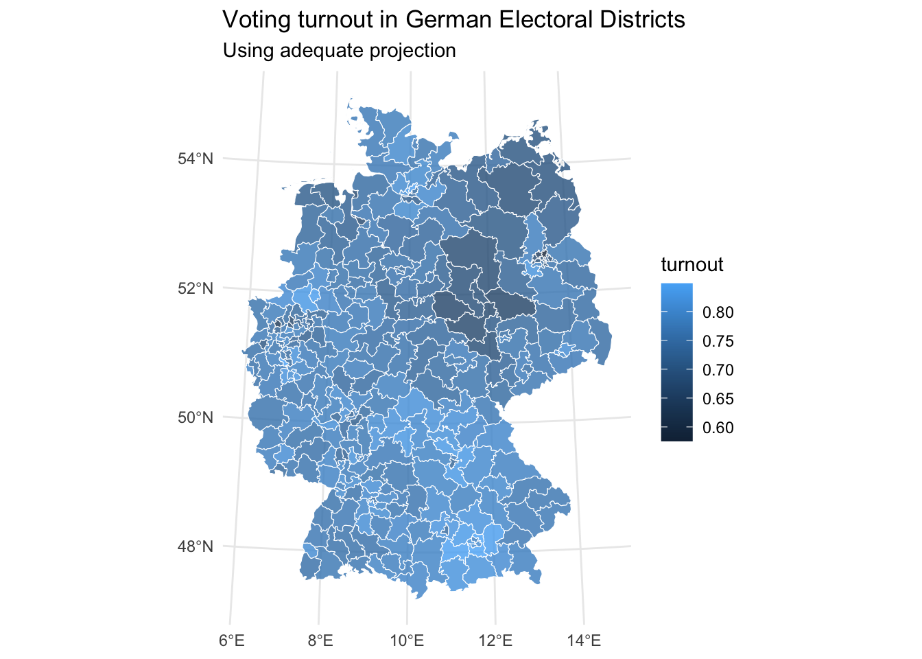
- Calculate Moran’s I both globally and locally for turnout. What do you see?
Solution. Click to expand!
# global
turnout_shape <- left_join(
  fixed_districts,
  turnout,
  by = c("WKR_NR" = "nr")
)

weights <- poly2nb(turnout_shape |>
                     st_geometry(),
                   queen = TRUE) |> # queen shares point or border
  nb2listw(style = "W")

morans_i_turnout <- moran.test(x = turnout_shape$turnout,
                               listw = weights_singular,
                               alternative = "two.sided")
morans_i_turnout
    Moran I test under randomisation

data:  turnout_shape$turnout
weights: weights_singular

Moran I statistic standard deviate = 13.275, p-value < 2.2e-16
alternative hypothesis: two.sided
sample estimates:
Moran I statistic       Expectation          Variance
      0.475027070      -0.003367003       0.001298676
# local
local_morans_i_turnout <- localmoran(turnout_shape |>
pull("turnout") |>
scale(scale = FALSE) |>
as.numeric(),
weights,
alternative = "two.sided")
local_morans_i_turnout_tbl <- turnout_shape |>
mutate(turnout_centered = scale(turnout, scale = FALSE)) |>
bind_cols(
tibble(local_moransi = local_morans_i_turnout[,1],
z_scores = local_morans_i_turnout[,4],
p_value = local_morans_i_turnout[,5])
)
local_morans_i_turnout_tbl |>
ggplot() +
geom_sf(aes(fill = turnout), alpha = 0.8, col = "white") +
coord_sf(crs = 4839) +
labs(title = "Local Moran's I of turnout",
subtitle = "Using adequate projection") +
theme_minimal()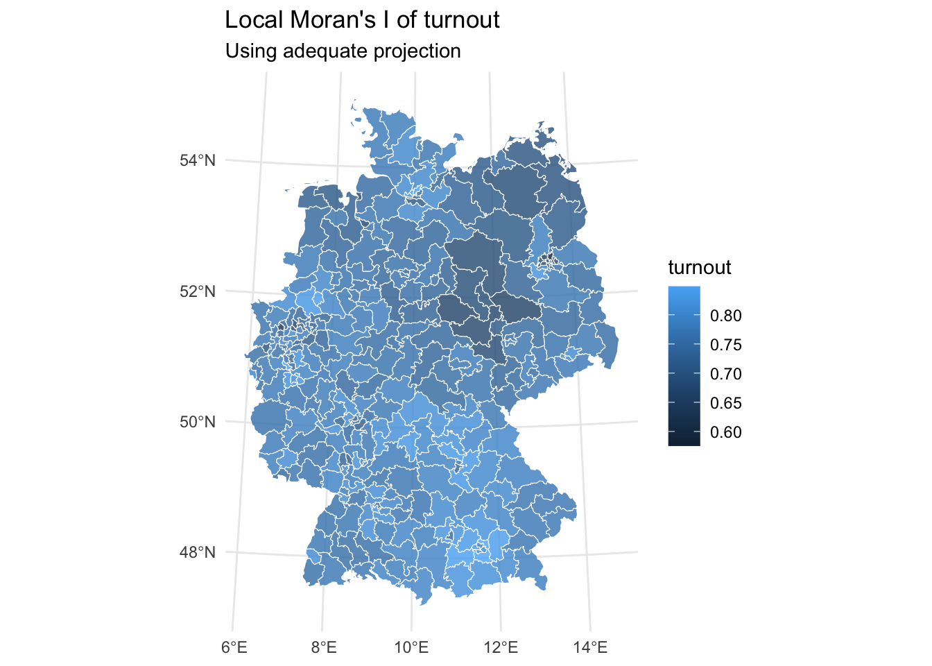
local_morans_i_turnout_tbl |>
  ggplot() +
  geom_sf(aes(fill = local_moransi), alpha = 0.8, col = "white") +
  coord_sf(crs = 4839) +
  labs(title = "Local Moran's I of turnout",
       subtitle = "Using adequate projection") +
  theme_minimal()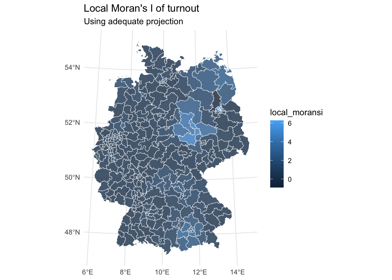
local_morans_i_turnout_tbl |>
  ggplot() +
  geom_sf(aes(fill = z_scores), alpha = 0.8, col = "white") +
  coord_sf(crs = 4839) +
  labs(title = "Local Moran's I of turnout",
       subtitle = "Using adequate projection") +
  theme_minimal()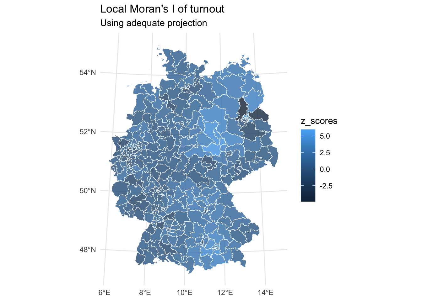
local_morans_i_turnout_tbl |>
  ggplot() +
  geom_sf(aes(fill = p_value), alpha = 0.8, col = "white") +
  coord_sf(crs = 4839) +
  labs(title = "Local Moran's I of turnout",
       subtitle = "Using adequate projection") +
  theme_minimal()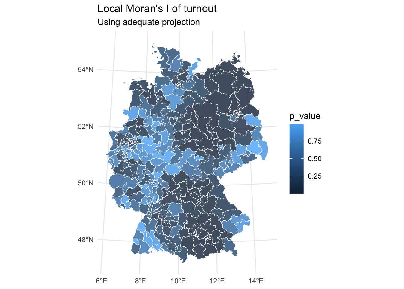
cluster_color <- c(
  "High-High" = "#FF0000",
  "Low-Low" = "#0000FF",
  "High-Low" = "#FFA500",
  "Low-High" = "#00FFFF",
  "Not Significant" = "#CCCCCC"
  )

local_morans_i_turnout_tbl |>
  mutate(spatial_lag = lag.listw(weights_singular,
                                 turnout_shape |>
                                   pull("turnout") |>
                                   scale(scale = FALSE))) |>
  mutate(cluster_type = case_when(
      p_value >= 0.05 ~ "Not Significant",
      turnout_centered > 0 & spatial_lag > 0 ~ "High-High",
      turnout_centered < 0 & spatial_lag < 0 ~ "Low-Low",
      turnout_centered > 0 & spatial_lag < 0 ~ "High-Low",
      turnout_centered < 0 & spatial_lag > 0 ~ "Low-High"
    )) |>
  ggplot() +
  geom_sf(aes(fill = cluster_type), alpha = 0.8, col = "white") +
  coord_sf(crs = 4839) +
  labs(title = "Local Indicators of Spatial Autocorrelation of Turnout",
       subtitle = "Colored by ",
       fill = "Cluster Type") +
  scale_fill_manual(values = cluster_color) +
  theme_minimal()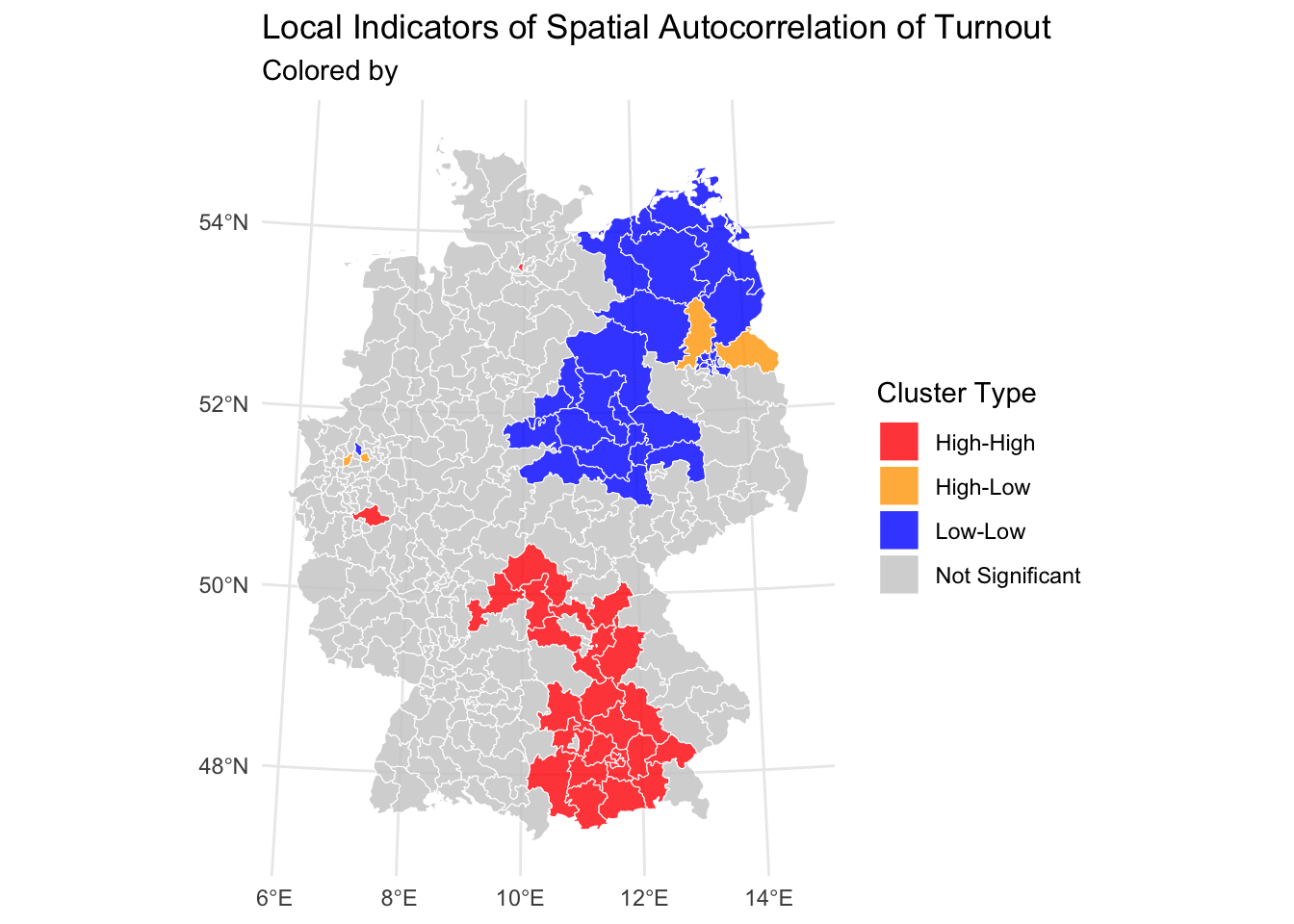
Further links
- A tutorial dealing with Moran’s I
- More on mapping
- Geocomputation with R – Lovelace, Nowosad, and Muenchow (2025)
- The
sfwebsite - Find adequate projections here